What is sector rotation?
Sector rotation is the idea that during different economic periods different industry sectors are bought up because they are thought of as safer industries to have your assets. The main sectors are: Information Technology (XLK), Health Care (XLV), Consumer Discretionary (XLY), Financials (XLF), Communication (XLC), Industrials (XLI), Consumer Staples (XLP), Energy (XLE), Real Estate (XLRE), and Materials (XLB). The idea is that Consumer Staples, Energy, Healthcare, Communication Services, Utilities and Real Estate are the best sectors to be in during economic downturns because they are things that people still need and rely on even when money is tight. Historically, Energy is the best-performing sector in the S&P 500 during periods when inflation rises. In 2022, Energy and Health Care stocks were the best performing stock sectors. Historically, Big Tech and Growth stocks go up when interest rates are going down because future earnings are effected as the federal interest rate rises. When interest rates rise, the value is discounted due to projected future growth and cash flow being discounted. Another thing to keep in mind is that Indexes and ETFs do not give equal weight to each individual stock sector. The chart below shows the different weight of each sector in the S&P 500 Index.
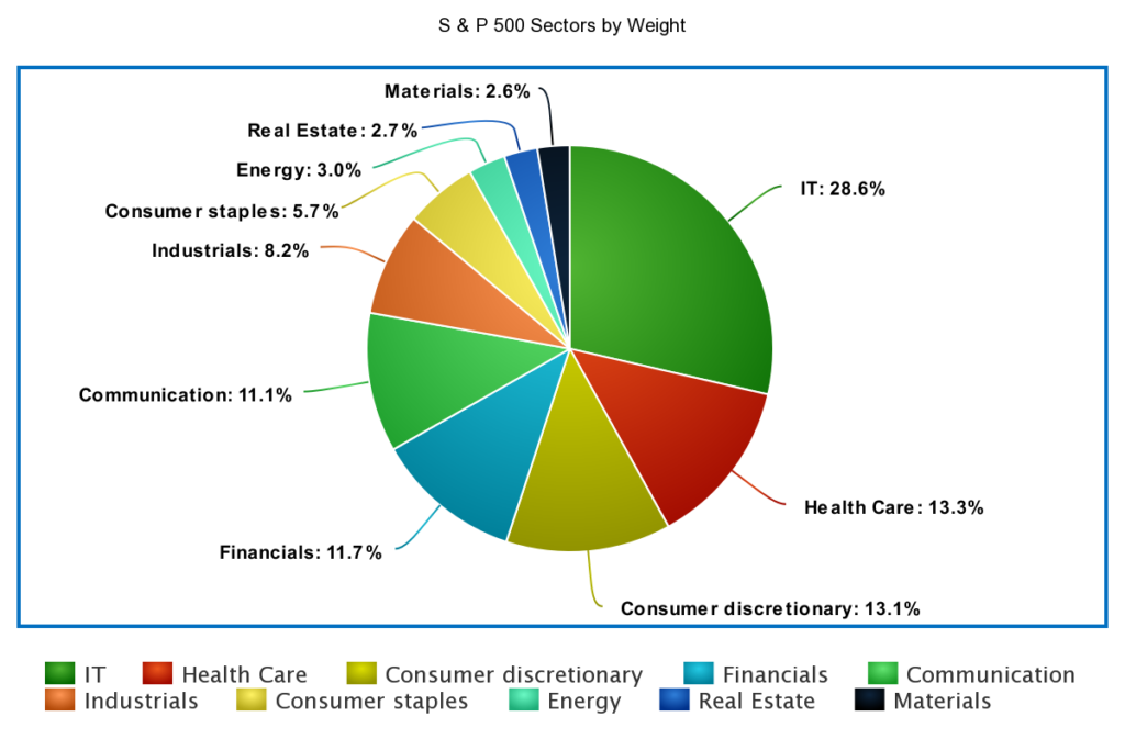
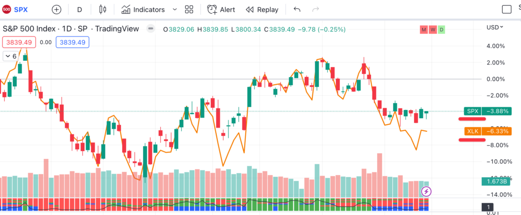
What this means is Informational Technology stock prices have a much bigger effect on the S&P 500 than Materials stocks. How this information can help you is if, for example, the Information Technology (XLK) sector is in a downtrend, then it it is likely that the S&P 500 is also in a downtrend. Notice how their movement is not exactly the same because the S&P 500 includes more stocks (and sectors) but because the Information Technology section carries the most weight (28.6%) in the S&P 500 the movement of SPX and XLK are similar but distinct.
How to find sector rotation?
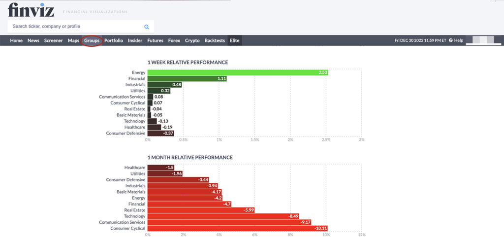
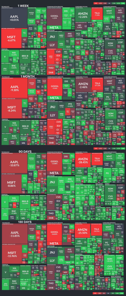
An easy way to check which sectors are leading is by looking in the groups section of finviz (free tool). You can see short term trends and which sector is in the lead. Notice the Energy sector performed well on the 1 week scale but that every sector was in the negative percentage performance on the 1 month scale. This would indicate that over the course of the month (December 2022) the S&P 500 was in a downtrend.
The other section to look at is the Maps section of finviz and you can see a visual representation of the different sectors and the stocks that are included, as well as if they are moving up (green) or moving down (red). The maps section has the advantage of giving you the names of individual stocks and their movement when you scroll over that section of the map.
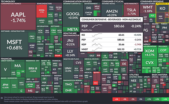
Another great way to visually look for sector rotation is to look at the heat maps on different timeframes in finviz. If you compare the one week map with the one month, three month and six month charts you can visually see how the sectors change over time. You should look to see which sectors are the brightest green/have the most green on the 180 day chart and take note of those. Also note which are the brightest red/contain the most red. Then as you look through the shorter timeframes take note of the changes over time. Are different sectors now green? Did the ones that were green on the 180 day map change color (or depth of color)? For example, if you look at semiconductors, 180 days ago there was a lot more red present, where as, on the one week map the sector is mostly bright green. Another example is Real Estate is red on the 180 day map but then on the 90 day it is green. This is indicating sector rotation. The idea is to move out of or stay out of the sectors that are red. So currently looking at the 1 week map you most definitely don’t want to be buying stocks in the Healthcare Plans, Beverages, or Diagnostics and Research. Even if a sector has a mixed color range, if there are other ones that are mostly bright green or green those are the better places to buy stocks because ~50% of a stock’s move is tied to the performance of it’s overall sector or industry.
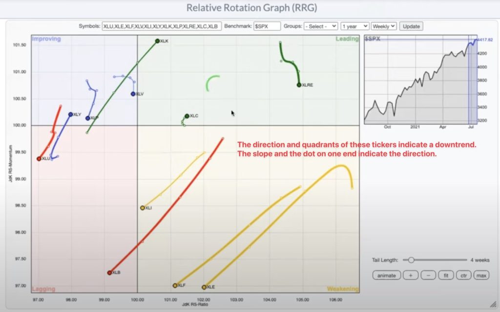
If you have a subscription (or free trial) to stockcharts.com an easy way to visualize this information is with the relative rotation graph (RRG). The way to use this with sectors is to input the 10 sector tickers into the symbol field and evaluate the quadrant and direction of each ticker. In the example below, you can see that XLK, XLC and XLRE are in the Leading Quadrant but that the trajectory of each’s Relative strength is different. The dot represents the current placement and direction of the line. You want the slope moving from the bottom left to the upper right but more importantly the dot being in the green leading quadrant, indicating an uptrend.
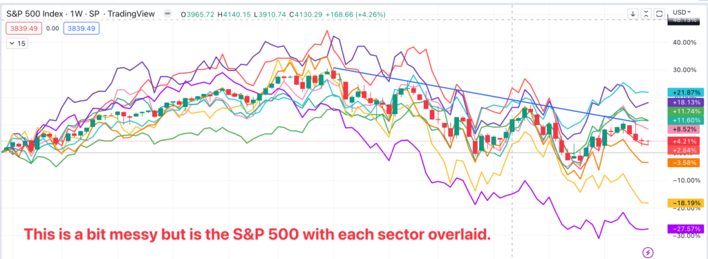
In TradingView it is possible to overlay multiple ticker symbols on your S&P 500 (SPX) chart.
Does sector rotation work?
“My studies have consistently shown that two equally bullish charts will perform far differently if one is from a bullish sector while the other breakout is from a bearish group.” -Stan Weinstein
In a nutshell, yes, sector rotation can provide indicators as to stocks that are current market leaders. However, I would not think about the historical precedents of leading sectors and blindly buy stocks in those sectors. You must always first make sure that a stock meets your strategy criteria before purchasing shares. It is important to focus on the top-ranked stocks in the top-ranked industry groups. Remember, almost half a stock’s price depends on the strength of it’s industry group and sector.

In general, you want to look at sector rankings, secondly, look at sector rotation trends and then focus on the best names in top sectors. Next analyze individual stock chart setups for high quality stocks that meet your strategy criteria (you have a strategy, right?).
Using the examples above, we were able to determine that Energy is a leading sector (Dec 2022). Our next step would be to determine which Industries in the Energy Sector have positive action.
- Determine the leading sectors
- Determine which industries within that sector are performing well (in the scan below this step was unnecessary because there were so few names produced)
- Find the stocks in the leading sector/industry that are market leaders.
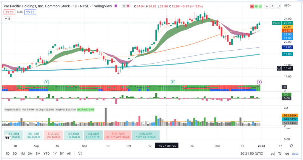
Look for stocks that have daily volume of 500k, the price is above $20, it has institutional ownership, and it’s in the upper range of it’s 52 week high (in this case I set it to within 30% of 52 week highs). You are trying to narrow down the list of ticker symbols to the leading names.

- Look through the charts to find tickers that fit into your strategy.
Stock Market sector rotation is a tool that you can add to your arsenal to find market leading stocks.
*I am not an affiliate nor am I sponsored by any of the above mentioned tools. I have a paid subscription to TradingView. Finviz is a free tool and could be used exclusively to apply this learning.